Can I Use Botanical Art in a Modern Minimalist Home? Compatibility with Contemporary Design Styles

The Evolution of Restorative Interiors and Organic Minimalism
Modern residential design has undergone a significant architectural shift away from the stark, clinical minimalism that characterized the early 2010s. In that era, homes were dominated by cool gray palettes, highly reflective synthetic surfaces, and sharp, geometric angles. While these spaces achieved visual cleanliness, empirical observations indicate they often induced a sense of sterile enclosure and heightened cognitive fatigue. The contemporary design movement has pivoted toward organic minimalism, prioritizing hand-rendered shapes, soft textures, and earthy timber tones to construct emotionally restorative spaces. Within this context, botanical art has transitioned from a traditional floral embellishment to a critical design tool. By bridging the gap between clinical architecture and the natural world, botanical art introduces organic variations that soften rigid architectural spaces without creating visual noise. The biophilic design movement has driven a forty percent increase in nature-themed art sales in major North American and European markets since 2015, reflecting a societal preference to re-establish environmental connections indoors.
Cognitive Restoration and the Neurobiology of Natural Art
The integration of botanical wall art in minimalist spaces is supported by evolutionary biology, environmental psychology, and neuroscience. Human sensory systems developed in natural habitats where visual patterns, lighting variations, and organic structures signaled safety and resources. Modern indoor spaces often isolate occupants from these cues, forcing the brain to engage in continuous directed attention. This constant cognitive effort fatigues the prefrontal cortex, leading to diminished problem-solving capacity, higher error rates, and physical stress. Introducing nature-inspired visuals provides a non-medicinal intervention that restores focus and supports mental clarity.
The Science of Green Wavelengths and Ocular Rest
The human eye processes natural colors with high efficiency due to its evolutionary history. Peak spectral sensitivity is tuned to a wavelength of approximately 555 nanometers, which sits in the yellowish-green spectrum of healthy foliage. When an observer views desaturated greens, such as sage, olive, or forest green, the ciliary muscles of the eye relax. This physiological change lowers strain on the visual cortex, triggers the parasympathetic nervous system, and helps reduce systemic stress biomarkers like cortisol and heart rate.
Fractal Fluency and Mathematical Cognitive Ease
Benoît Mandelbrot coined the term "fractal" in 1975 to describe self-similar geometric shapes that repeat at progressively smaller scales. Nature utilizes this geometry to build structures such as fern leaves, tree branches, and river deltas. Dr. Richard Taylor at the University of Oregon demonstrated that human vision is highly fluent in processing statistical fractals with a moderate complexity dimension.
Galvanic skin response and EEG monitoring confirm that observing these midrange fractal patterns lowers physiological stress levels by up to sixty percent within ten seconds. While low-complexity patterns are perceived as dull and highly complex, spiky patterns can be overstimulating, midrange fractal patterns fall into a restorative "sweet spot". Incorporating botanical prints that showcase these natural geometries allows the brain to achieve cognitive ease, supporting attention restoration and lowering mental fatigue.
Structural Compatibility Across Contemporary Design Styles
Botanical wall art is highly versatile, adapting fluidly across various contemporary minimalist styles. However, achieving compatibility requires aligning the artistic medium, subject matter, and color palette with the specific architectural rules of each design movement.
Japandi Style
Japandi design relies heavily on the philosophy of wabi-sabi—the appreciation of beauty in imperfection and impermanence. Botanical art aligns with this principle when it features single-stem studies, delicate line drawings, or desaturated watercolor leaves that emphasize the delicate, natural architecture of the plant. The prints must feel light and deliberate, giving the wall negative space, which prevents the room from feeling crowded. Staggering or displaying single-branch prints on light stucco or cream-toned walls reinforces the serene atmosphere of the Japandi aesthetic.
Scandinavian Simplicity
Scandinavian interiors maximize natural light and maintain an airy, breezy atmosphere. Botanical prints in these environments should opt for soft, desaturated watercolor styles featuring eucalyptus leaves, meadow wildflowers, or airy ferns on off-white or light gray backgrounds. The goal is to bring a soft touch of organic color into a neutral room without disrupting the spatial continuity of the walls. Utilizing delicate, light-colored botanicals keeps the room feeling fresh, clean, and intimately connected to the Nordic landscape.
Modern Industrial
Industrial spaces feature cold surfaces like concrete, brick, and steel, which benefit from the softening texture of botanical prints. Bold, graphic foliage such as monstera silhouettes, structural pine needles, or high-contrast black-and-white botanical photographs introduce dynamic movement into geometric spaces. The sharp contrast of monochrome plant art mimics the structural grids of industrial architecture while providing the psychological safety and visual comfort of the natural world.
Organic Modernism
Organic modernism embraces hand-crafted textures, plaster finishes, and curvilinear shapes. Rather than using exact scientific drawings, this style favors abstract leaf art, warm watercolor compositions, and layered plant silhouettes. Pairing these prints with tactile interior accents such as linen curtains, unglazed ceramics, and raw stone ornaments creates a highly cohesive, sensorially rich environment. Vintage botanical illustrations, stemming from eighteenth- and nineteenth-century scientific plates, can also be updated with sleek, modern frames to prevent a dated feel, aligning with the contemporary "New Exoticism" movement.
The Material Science of Premium Visual Assets
The distinction between a high-end minimalist home and a casual interior often relies on the physical quality of its wall art. Mass-market prints frequently look unrefined due to thin poster paper that curls, flat colors from low-grade inks, and poor framing. High-quality print collections, such as those designed by ArtoLeaf, prioritize durability, color accuracy, and premium framing to ensure the artwork lasts for years.
- Printing and Paper: High-end botanical prints utilize archival pigment-based inks on ultra-premium luster photo paper. Unlike standard dye-based inks, pigment inks provide deep color saturation and resist fading over time. Luster finishes minimize glare while maintaining rich color depth, which is ideal for minimalist homes with large windows and bright, natural light.
- Framing and Glazing: Pre-framed artwork saves homeowners from the high costs of custom framing, which can quickly double the price of unframed prints. Premium framing uses solid woods like ayous, which are lightweight and highly durable. For glazing, lightweight Acrylite front protectors are preferred over heavy glass. Acrylite offers the clean, clear appearance of glass with subtle light reflection and excellent durability.
- Alternative Mediums: High-end biophilic design also incorporates preserved plant elements, such as moss wall art, where the plant's internal water is replaced with glycerin. This preservation process maintains the soft texture and vibrant color of ferns and mosses without the need for watering or ongoing maintenance, offering an excellent alternative for interiors with limited natural light.
Curatorial Layout Mathematics and Spatial Placement
In minimalist design, proper scale and positioning are essential. Hanging artwork that is too small forces the eyes to scan the empty wall space, which can increase cognitive fatigue. Conversely, hanging oversized art in a cramped space can feel visually overwhelming. Achieving a balanced layout relies on precise spatial mathematics and architectural formulas.
The Two-Thirds Rule for Furniture Alignment
When hanging botanical prints over a focal piece of furniture (such as a sofa, headboard, or console table), the total horizontal width of the artwork collection (W_art) should represent 60% to 70% (or up to 85%) of the furniture's width (W_furniture). This relationship is expressed as:
W_art ≈ W_furniture X 0.65
For example, displaying a botanical triptych over an 84-inch sofa requires an ideal total artwork span of approximately 54 to 58 inches to anchor the seating area properly.
The Rule of Three-Eighths for Isolated Walls
When decorating a blank, isolated wall with no anchoring furniture beneath, the artwork width must be proportional to the wall length to prevent a cluttered appearance. The negative space on either side of the framed piece should be roughly three-eighths (37.5%) of the wall's total horizontal length, leaving the remaining 25% of the wall centered for the artwork. To find the optimal artwork width (W_ideal), multiply the total wall length (L_wall) by 0.57:
W_ideal = L_wall X 0.57
Standard Height and Vertical Margins
Professional art curators align the center point of any wall display at exactly 57 to 58 inches (145 cm) from the floor. This standard height matches the average human eye level, allowing viewers to appreciate the art comfortably. When hanging art over furniture, the lower edge of the frame should sit exactly 6 to 10 inches (15 to 25 cm) above the furniture back to create breathing room.
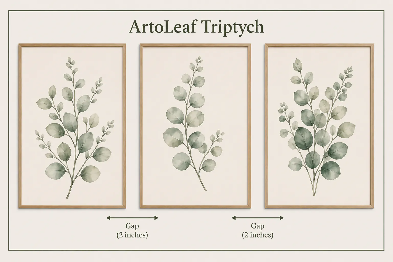
Spacing Mathematics for Multi-Panel Art
A triptych—a coordinated set of three prints—is an excellent way to introduce botanical art into minimalist homes, offering structural balance and visual rhythm without introducing clutter. Spacing the panels correctly is critical: hanging them too far apart disrupts the visual flow, forcing the eye to see three separate prints rather than one cohesive composition. The total horizontal width of a triptych set (W_total) is calculated using the following equation:
W_total = 3 X W_print + 2 X G_gap
Where W_print is the width of an individual frame, and G_gap represents the spacing distance between the frames.
The following table outlines the recommended spacing dimensions for various print sizes from the ArtoLeaf collection to ensure clean visual margins:
Hanging multi-panel art requires a methodical approach to prevent uneven spacing. The center-out hanging method is recommended to maintain balance and symmetry. First, determine the exact midpoint of the wall or the furniture piece below. Mark this point lightly with a pencil at eye level (approximately 58 inches from the floor). Hang the center print first, using a spirit level to ensure it is perfectly straight. Measure outward from the outer edge of the center frame, marking the recommended gap distance on both sides. Use painter's tape to visualize these gaps before making any pencil marks or nail holes. Using the spirit level, align the top edges of the left and right frames with the center frame, and secure them in place. Finally, step back to evaluate the spacing and visual balance, making any minor adjustments as needed.
Strategic Integration of ArtoLeaf Collections
Integrating botanical prints into a modern minimalist home is easy with curated, premium options. ArtoLeaf specializes in museum-grade, ready-to-hang framed botanical art designed to complement contemporary home environments. Every ArtoLeaf print is produced on ultra-premium luster photo paper for vibrant colors and maximum ink coverage, then hand-refined by skilled designers to ensure balanced tones and perfect visual composition.
Cohesive Botanical Collections
The Eucalyptus Botanical Framed Wall Art Set of 3 is a beautifully coordinated triptych featuring soft sage tones, balanced compositions, and delicate watercolor textures. It offers an effortless way to create a calming gallery display over a sofa, in a dining room, or along an open-plan hallway.
For a simpler, more graphic aesthetic, the Field Notes Botanicals Set of 3 features delicate wildflowers and field grasses drawn on a clean white background. Displayed in slim black frames, this collection brings quiet structure and timeless elegance to Japandi, Scandinavian, and minimalist interiors.
Harmonious Art Pairings
- Eucalyptus Branch & Layered Sage Leaves: Pairing the graceful curves of the Eucalyptus Branch print with the soft, overlapping shapes of the Layered Sage Leaves print creates a beautiful sense of depth and movement on the wall. Both prints feature gentle watercolor textures that complement each other perfectly, making them ideal for modern bedrooms, calm home offices, and serene entryways.
- Eucalyptus Stem: The clean, vertical form of the Eucalyptus Stem print is an excellent choice for a standalone accent piece or as a coordinating addition to a larger gallery wall. Its elegant shape brings a refreshing touch of nature to narrow wall sections, dining spaces, and minimalist living areas.
These curated collections from ArtoLeaf feature high-quality ayous wood frames, Acrylite front protectors, and lightweight, easy-to-hang designs. Purchasing pre-framed sets from ArtoLeaf ($169.99 for a set of three 8"x10" prints) is highly cost-effective compared to buying individual prints and framing them separately. This allows homeowners to design a calming, restorative space without the high costs of custom framing. With fast, tracked shipping across the USA and Canada, styling a calming, biophilic home is entirely effortless
Synthesis and Design Recommendations
Using botanical art in minimalist spaces is more than a decorative trend; it is a science-backed design strategy that promotes cognitive restoration and stress reduction. Grounding aesthetic choices in spatial math and environmental psychology allows homeowners to turn blank walls into active, therapeutic sanctuaries.
To ensure a seamless and compatible display, the following design recommendations should be used when mounting botanical wall art:
- Select the design style: Match the print's colors and details with the room's aesthetic (for example, choosing sepia tones for Japandi styles or soft green watercolors for Scandinavian rooms).
- Apply the Two-Thirds Rule: Ensure the combined width of the artwork spans roughly 60% to 70% of the furniture width below it.
- Calculate perfect margins: Keep gaps between prints strictly between 1.5 and 3 inches to maintain a unified, cohesive layout.
- Position at eye level: Align the center of the artwork at 57 to 60 inches from the floor.
- Coordinate the framing: Choose natural wood frames to provide biophilic warmth, black frames to add dramatic contrast, or white frames to create a light and airy feel.
- Incorporate physical textures: Pair botanical wall art with natural materials such as linen, clay, unglazed ceramics, and living houseplants to complete the biophilic design.