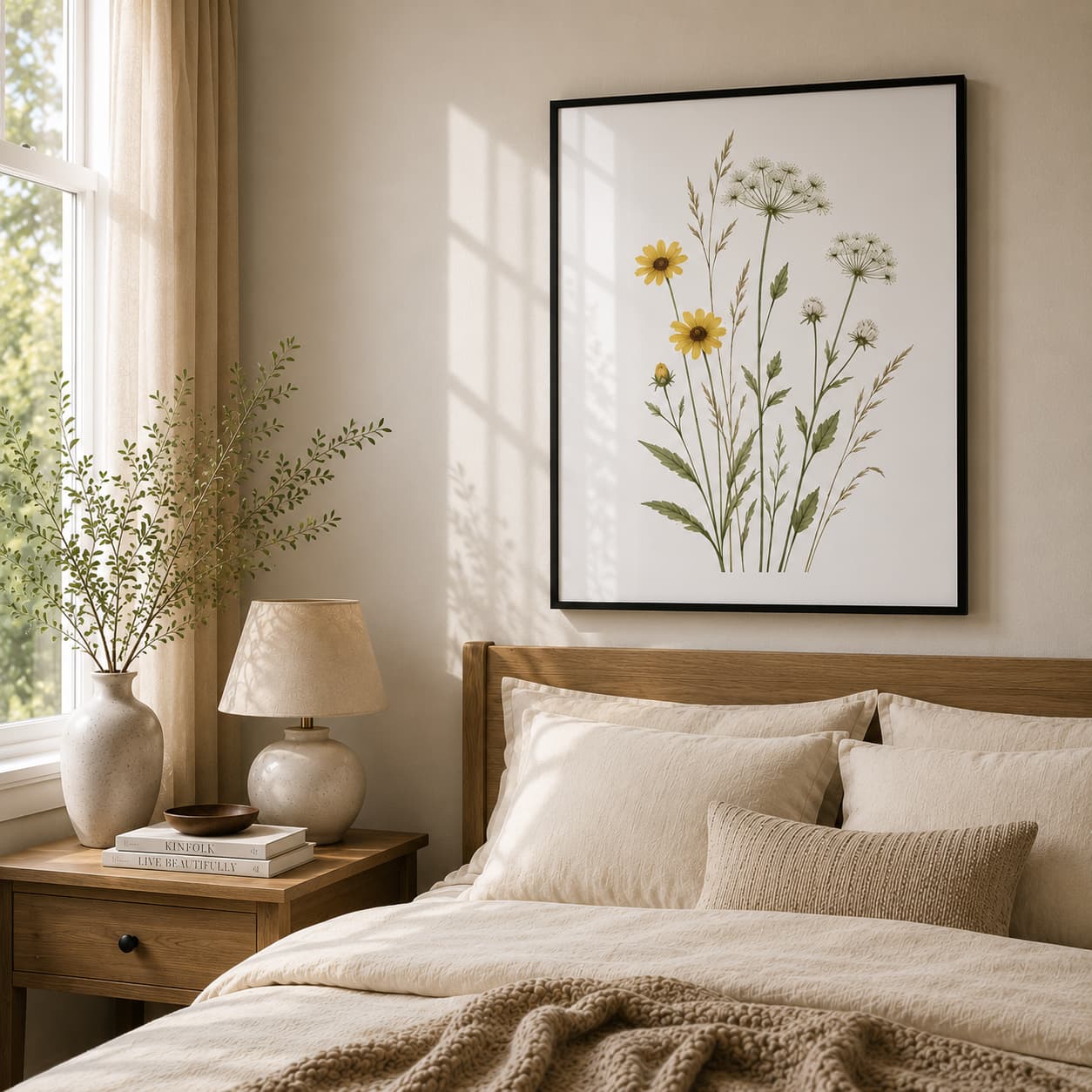
How to Choose Picture Frame Color for Any Wall

Every piece of art contains a complex mix of tones, textures, and lines that shape its visual presence. But before your eyes even register the central subject of a print, your brain has already processed its outer boundary: the frame.
Choosing a picture frame is not merely a superficial design choice; it is a cognitive framing mechanism. The color, texture, and contrast of a frame act as a visual gateway, determining how much attention your brain allocates to the artwork, how your ciliary muscles relax, and what physiological stress-recovery pathways are activated.
If you are styling premium botanical wall art for your home, understanding the environmental psychology and visual neuroscience behind frame selection can help you optimize both the aesthetic elegance and the healing potential of your space. Here is a science-backed breakdown of how to choose the right frame color—focusing on the therapeutic qualities of Red Oak, the formal structure of Black, and the airy openness of White.
1. The Evolutionary Science of Green Wavelengths & Ocular Rest
To understand why framing botanical art is so unique, we must look at how the human eye processes the color green.
Under daylight (photopic) conditions, the average normal-sighted human eye exhibits its peak spectral sensitivity at a wavelength of approximately 555 nanometers—which corresponds precisely to a yellowish-green hue.
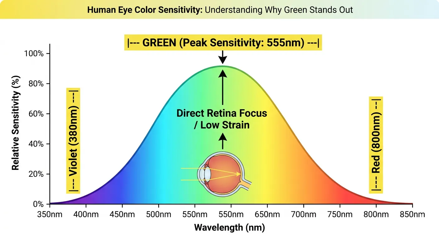
Because green sits dead center in the visible light spectrum, processing these wavelengths requires significantly less focusing effort from the ciliary muscles of your ocular lens. Green light focuses directly on your retina without complex distortion, physically giving your eyes a rest.
Furthermore, evolutionary psychology dictates that our ancestral brains are hardwired to associate lush green landscapes with safety, water, and food. Seeing green automatically triggers the parasympathetic nervous system, transitioning the body away from chronic, stress-induced sympathetic arousal.
The primary goal of framing a botanical print is to preserve or enhance this built-in physiological rest.
2. Red Oak Frames: Fractal Fluency and Cortisol Reduction
Choosing a natural Red Oak frame introduces an active, biophilic element of nature directly into your built environment. Wood is not just a texture; it is a scientifically proven therapeutic material.
The Physiological Proof of Wood Surfaces
In a landmark environmental psychology study, Dr. Sally Augustin and researcher Dr. David Fell analyzed the autonomic nervous system responses of 119 subjects before, during, and after completing a highly stressful mental arithmetic task. Their findings were remarkable: sympathetic nervous system activation (which drives the "fight-or-flight" response) was significantly lower in rooms featuring exposed wood. Skin conductance levels (which measure physiological stress and anxiety) remained lower in the wooden offices during both the pre-test and post-test recovery periods.
Dr. Marjut Wallenius, a leading Doctor of Psychology at the University of Tampere, summarized this phenomenon:
"Wood has psychological effects on people and a similar stress-reducing effect to nature."
This is backed by global clinical research:
- Lowered Heart Rates: An Austrian study by Kelz et al. demonstrated that high school students taught in classrooms finished with real wood floors, ceilings, and walls had significantly lower average heart rates and reported lower levels of perceived stress than students in non-wood classrooms.
- Hypertension Mitigation: A Japanese study by Sakuragawa et al. comparing physical responses to wood versus steel panels revealed that viewing wood panels decreased blood pressure and dejection, whereas steel panels actively increased blood pressure and negative emotional states.
- Improved Concentration: Studies show that workplaces incorporating exposed wood surfaces report a dramatic boost in employee concentration, productivity, and overall workplace satisfaction.
Why Wood Grain Relaxes Your Brain in 10 Seconds
The therapeutic secret of Red Oak lies in its grain. Wood grain is a natural fractal—a geometric pattern that repeats self-similarly across multiple scales. Because the human visual system evolved over 600 million years in forests and natural landscapes, our brains developed "fractal fluency".
Research by physicist Dr. Richard Taylor shows that the human brain can process fractal structures with ease. When your visual system views a natural fractal pattern (which typically features a complexity or $D$-value between 1 and 2), a physiological resonance occurs. Looking at these patterns for just 10 seconds can reduce your physiological stress levels by up to 60%.
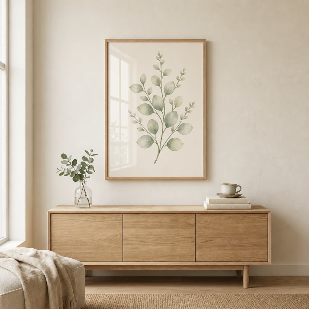
When to choose Red Oak for artoleaf.com art: Choose a natural Red Oak frame if your goal is biophilic comfort and physiological stress reduction. It works beautifully with earthy, warm-toned botanical prints, fern illustrations, and forest canvases, complementing rooms designed with Mid-Century Modern, farmhouse, or transitional decor.
3. Black Frames: Gestalt Psychology and Visual Attention
If a Red Oak frame is about soothing biophilic integration, a black frame is about visual authority, sharp contrast, and cognitive containment.

The Figure-Ground Law and Contrast Perception
Under the laws of Gestalt psychology, our brains organize visual stimuli by separating prominent "figures" from the receding background, or "ground".
Neurophysiological research reveals that neurons in the primary visual cortex (V1) and area V4 fire at a significantly higher rate when their receptive fields align with a clearly defined figure compared to a background region. This neural behavior, known as figure-background modulation (FBM), drastically alters our perception: the perceived contrast of a visual scene is significantly higher on Gestalt-defined figures.
A solid black frame acts as an absolute visual boundary. It maximizes FBM, boosting the perceived contrast of the green leaves and botanical shapes within the frame. The artwork pops, appearing sharper, more vibrant, and more detailed.
The Eye-Tracking Science of Attention Anchoring
According to cognitive eye-tracking studies, visual exploration is highly taxing for the brain. Our eyes continuously search for focal points using rapid, involuntary movements called saccades.
When you frame a print with a bold, contrasting black border, it triggers the Gaze Cascade effect. The high-contrast boundary immediately draws the eye inward and holds the gaze. Fixation duration is positively correlated with visual working memory and attention retention. By anchoring your gaze within the boundaries of the artwork, a black frame prevents your eyes from drifting aimlessly across a blank wall, saving precious cognitive energy.
When to choose Black for artoleaf.com art: A sleek black frame is perfect when you want a bold, dramatic focal point or a gallery-like presentation. It is highly recommended for minimalist spaces, industrial lofts, and highly saturated, graphic botanical prints.
4. White Frames: Spatial Continuity and "Soft Fascination"
A white frame works on a completely different psychological wavelength, prioritizing visual airiness, lightness, and spatial continuity.
Embracing the Property of "Extent"
According to Rachel and Stephen Kaplan’s Attention Restoration Theory (ART), for an indoor environment to be truly restorative, it must possess the quality of extent—a sense of rich coherence and physical or conceptual scale that invites exploration.
While a black frame contains and isolates an image, a white frame (especially on light-colored walls) softens the boundary. The artwork feels less enclosed and more naturally integrated with the room's architecture. This seamless transition tricks the brain into perceiving a higher degree of spatial openness and lightness, making small rooms, tight alcoves, or low-light hallways feel larger and more welcoming.
Encouraging Soft Fascination
By merging the boundaries of the frame with the wall, white frames direct all of your attention to the gentle, organic curves of the botanical art itself, facilitating soft fascination. Soft fascination is an effortless, involuntary form of attention that gives the prefrontal cortex a complete break from the directed attention fatigue of modern screen-time and analytical work.
When to choose White for artoleaf.com art: Opt for a white frame if you want a clean, breezy, modern Scandinavian or coastal aesthetic. White frames are unmatched when displaying delicate watercolor botanicals, pastel-toned leaves, or minimalist sketches on light-colored walls.
5. The Botanical Framing Decision Matrix
To simplify your styling process, use this science-backed diagnostic guide:
6. Professional Styling Rules for Botanical Art
To ensure your curated artoleaf.com pieces reach their full design and therapeutic potential, follow these strict curation rules :
- Complement the Art, Not Just the Room: The single most common mistake is choosing a frame to match your couch or rug rather than the artwork itself. Trends in furniture change, but a timeless, complementary frame allows your botanical art to transition beautifully from room to room over a lifetime. When in doubt, timeless square cap profiles like Gallery Natural wood, Gallery Black, or Gallery White are your safest investment.
- The "57-Inch Rule" for Cognitive Balance: To achieve a comfortable, museum-standard viewing height, hang your frames so that the vertical center of the artwork sits exactly 57 inches from the floor (the average human eye level). Ensure there is plenty of breathing room on either side of the frame to prevent a cramped, anxiety-inducing visual design.
- Mastering Mat Dimensions: Adding a neutral mat provides a resting space for the eye. For small botanical prints (under 11x14 inches), use a 1.5-to-3-inch mat border to elevate the art's presence. For large pieces (over 16x20 inches), opt for a 2-to-3-inch mat, or choose a "full-bleed" layout (no mat). If choosing the no-mat style for high-value prints, ensure you include a physical frame spacer to prevent the acrylic glass from touching the delicate face of the art.
By pairing the natural beauty of artoleaf.com botanical wall art with a scientifically selected frame, you create more than a beautiful room—you build a therapeutic sanctuary for your mind.
Natural Wood, Black & White Frame Studies
Solid ayous wood frames in finishes that accentuate warm whites, earthy tones, and contrast walls.
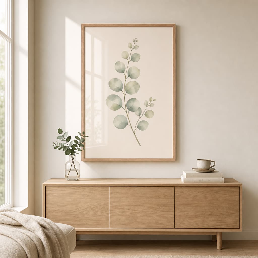
Eucalyptus Branch Framed Botanical Wall Art — Minimalist Watercolor
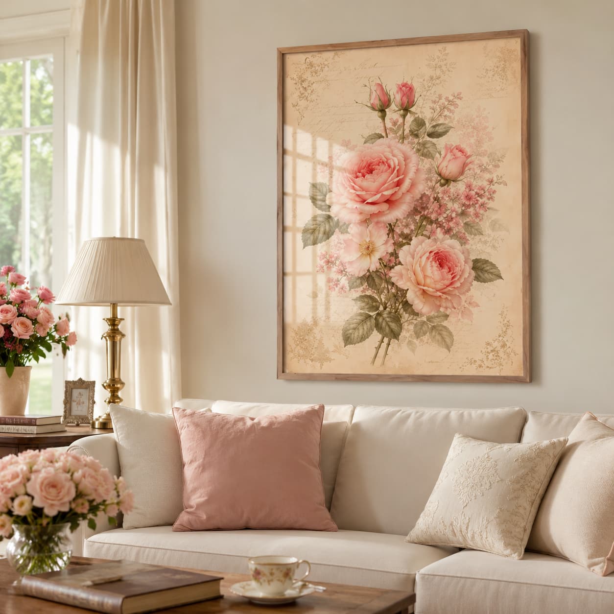
Romantic Blush Rose Botanical Framed Wall Art – Vintage Floral Wall Art for Elegant Interiors
Layered Sage Leaves Framed Botanical Wall Art — Minimalist Watercolor